Are your photos colour accurate?
Every day, millions of people snap photos, whether it be with their phone, a professional camera, a point-and-shoot, or even a webcam. We all take photos every day. Whether it's of our loved ones, our environment, our items, popular scenery, unpopular scenery, or even something minute, such as an advertisement we see posted on a lamp post. Now, how about I tell you that every single photo you’ve taken isn't colour-accurate?
Don’t scramble and gather up your photos in a frenzy, worrying about your blues being greens or your reds being blues. That is never the case (unless you have some very old film waiting to be developed!) with modern photography. Most cameras can determine the difference between each and every shade of red, green, and blue; most of these shades we wouldn’t even notice a difference between with the naked eye. No, what I’m talking about is how your camera captures and processes these colours.
How does a camera process photographs?
Every digital camera shoots photos in some type of “Raw” file, but many, except DSLRs, mirrorless cameras, and recently, smartphones, don’t give us access to this Raw file. Instead, cameras take that Raw image and convert it into a JPEG image, which most, if not all, devices can open and view. “Raw” isn’t necessarily an image either. It’s just a string of code from which the sensor gathered light information from each red, green, and blue sub-photocell. It is up to software to interpret that file to create a preview of that image. This, of course, can be different between software, since there isn’t a perfect way to view a Raw file. Programs such as Adobe Lightroom, Apple Pixelmator, and Affinity Photo seem to do the best rendering of these Raw files.
When your camera converts these Raw files into JPEGs, they use computational editing to analyze the scene in which you had photographed. It tweaks the exposure, white balance, lens distortions, and colour to create an image that is pleasing to look at. This, of course, is different on every camera. Your smartphone will usually edit aggressively, ensuring every detail in shadows and highlights is visible, whereas your point and shoot will often keep contrast in your photograph.
So, how can I get accurate colours when shooting?
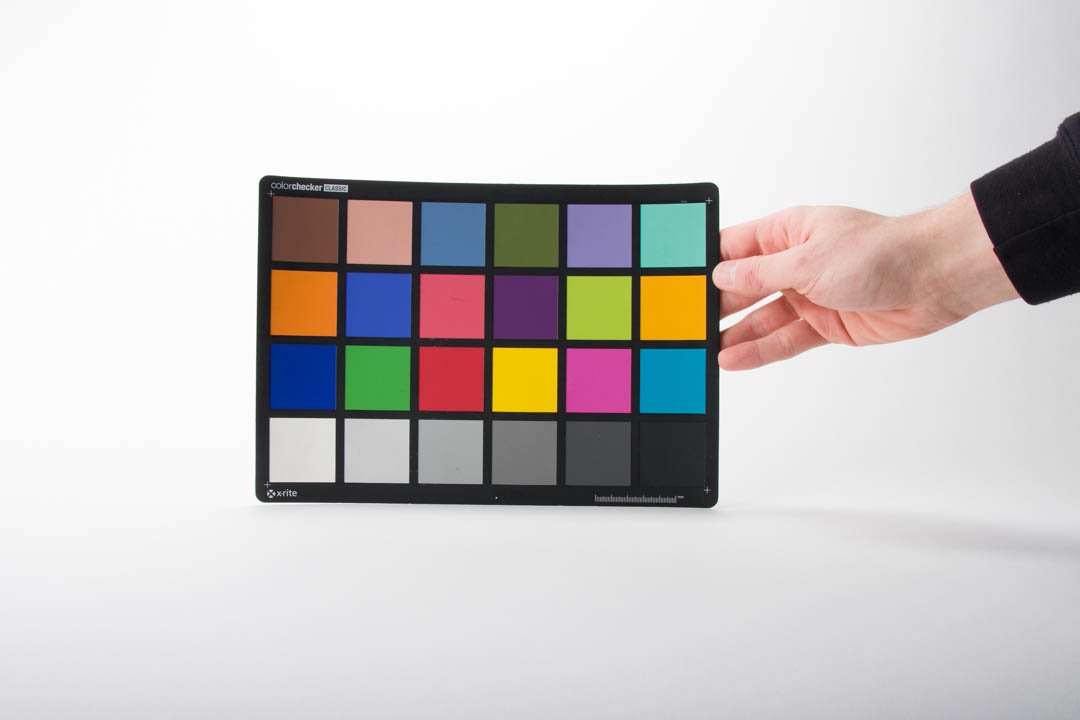
X-Rite Color Checker Classic being held by a hand with a white background.
Most cameras have different ways of rendering colours in an image. Canon is often known for its natural skin tones, whereas Nikon is known for its cool tones, which are great for landscapes. This is because each camera brand has its own formula, or in layman's terms, a “preset” when capturing an image. This can often be tuned by using your camera’s colour profiles, such as Landscape, Portrait, Standard, or Vivid, to alter how the camera renders colours.
The easiest way to get accurate colours when shooting is to have something to reference colour off of. The most convenient way of doing this is using a colour sheet, such as those offered by X-Rite. Oftentimes, there is software that comes bundled with these colour sheets, which analyzes your photo of the colour sheet and makes adjustments accordingly.
Now, usually you wouldn’t use colour card calibration on any old JPEG photo. The preferred way is to calibrate a Raw image, so that instead of correcting your camera’s image processing and “preset,” you’re correcting any inconsistencies from your camera’s sensor, because, believe it or not, every camera sensor captures light and colour in vastly different ways, by nature of design.
Why should I colour correct then?
Matching colours between two cameras:
Say you’re shooting with a Canon 5D Mark III and a Canon 90D, just like I had to do when shooting a music festival. In theory, these cameras are made by the same company, so they should shoot similarly, right? Well, not quite.
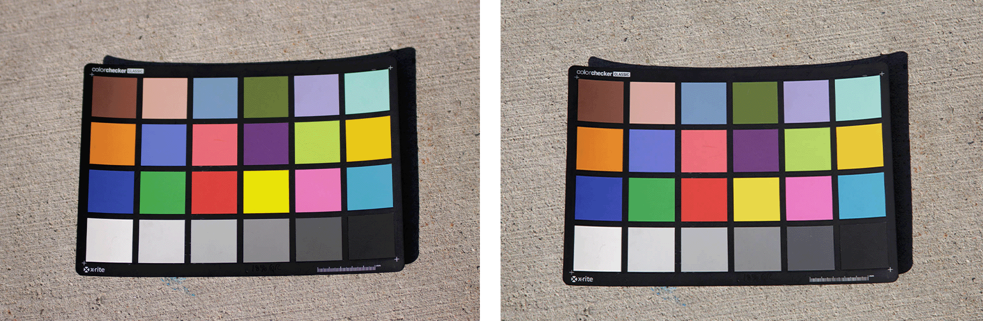
Left: Canon EOS 90D with X-Rite Color Checker Classic, Right: Canon EOS 5D Mark III with X-Rite Color Checker Classic
As you can see, there is not much difference at all. These photos were processed in Adobe Lightroom, with “Camera Neutral” selected as the colour profile, with a white balance of Daylight. But, even though there isn’t much, there is still a difference. Looking at the skin tone block (very top, 2nd from left), the 5D Mark III renders that colour a bit more magenta compared to the 90D. The yellow (3rd down, 4th from the left) is more puncy and vibrant on the 90D. This makes a difference when shooting an event with two or more cameras, and having colour correction means there are no inconsistencies when delivering to your client.
Ensuring colour precision for colour-critical photographs
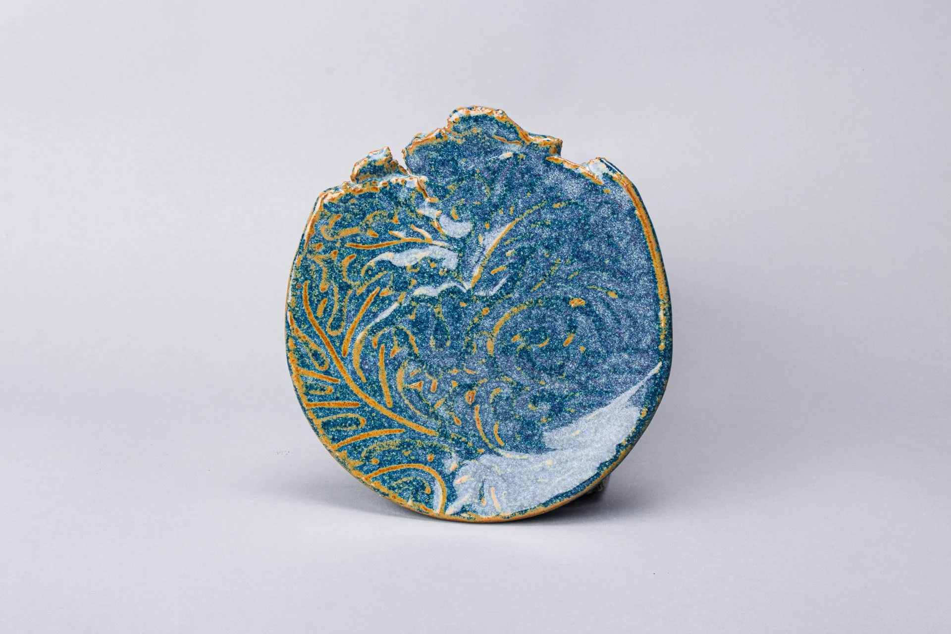
A blue and yellow ceramic plate.
Another use for colour correction is when you are shooting something that requires colour precision, such as fine art. Here, we have a ceramic plate. In real life, the colour of this plate is a megestic deep sky blue along with a rich golden orange accent. Straight out of the camera, though? Cyan and gold. Colour correcting this image gave this plate its true colour back, and when your client sees this and compares it to the real thing, they’ll be happy. But does all this really matter?
The reality.
The reality of colour correcting is that there are way more variables than just snapping a photo of a colour card and giving it to software to figure it out, and then lying back in your chair as the whole world gazes in your perfect colours. Your screen has a major role to play in how you and your client view the image. So, while I may have a $3000 colour calibrated display, your client may have a $500 smartphone with the “vibrant” screen profile enabled, thus rendering your effort of colour perfection a waste of time. Another factor in this is if you’re planning on printing your photographs: unless you print with a well-renowned lab, you may not be happy with the outcome. Colour depth embedded in a photograph may pose an issue, too. Say you posted a photo on Instagram, if you exported that image with Adobe RGB (which has rich colour depth), Instagram will convert it into an sRGB image, which reduces not only the amount of colours that are in the image, but also the vibrancy, as a side effect of reducing colour depth.
I’ll link this video by Tom Scott explaining how bit depth (aka colour depth) affects video content. He also talks about topics such as banding and compression, which are topics for another day.
But, in the end, remember that even if you calibrate your images, you know that your images are colour perfect, and if you’re lucky, your client will see the difference too.
For NBCCD Students ONLY! Service will end on May 30, 2026.
Your Art deserves to be photographed. Why not choose someone passionate about the details like you are?
This service is great for documenting, archiving, marketing, competitions, scholarships, and funding your work.
The Fine Art service includes:
3 High-resolution (3000px long) images per item.
2 overall shots of the item
1 detail shot (showing glaze, texture, materials up close).
Each photograph session is colour calibrated using an X-Rite Colour Card. This ensures your art photos are colour accurate.
Follow me on my socials!